Marc Jacobs
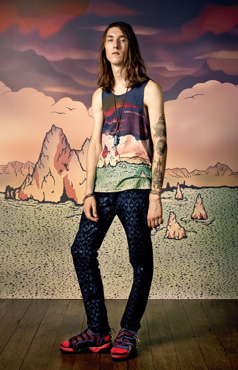
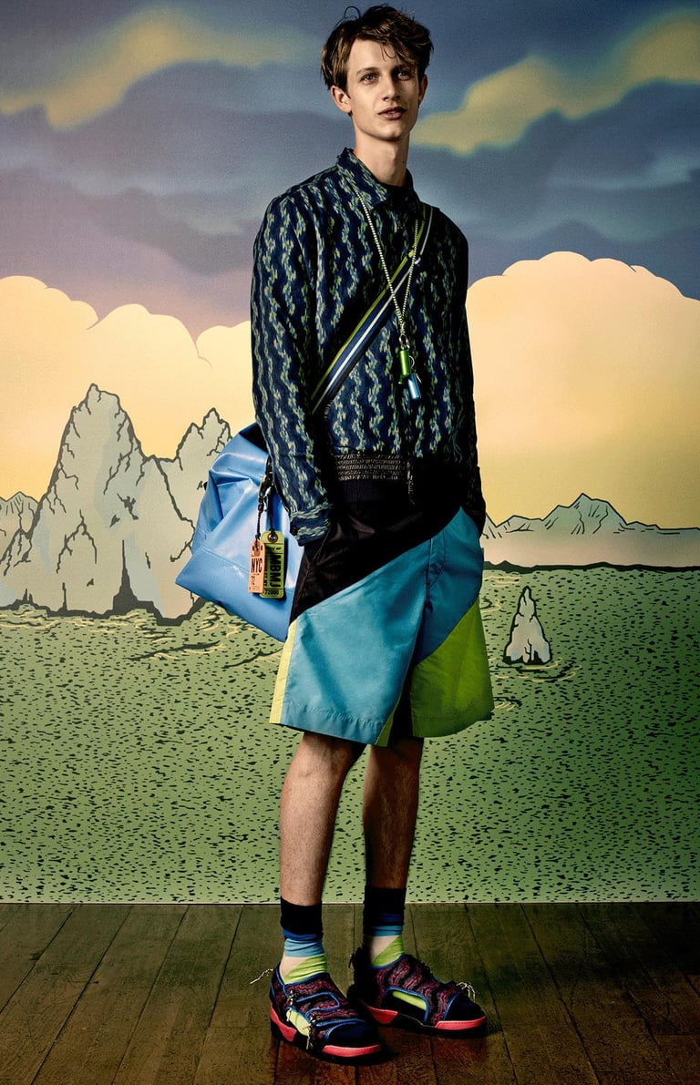
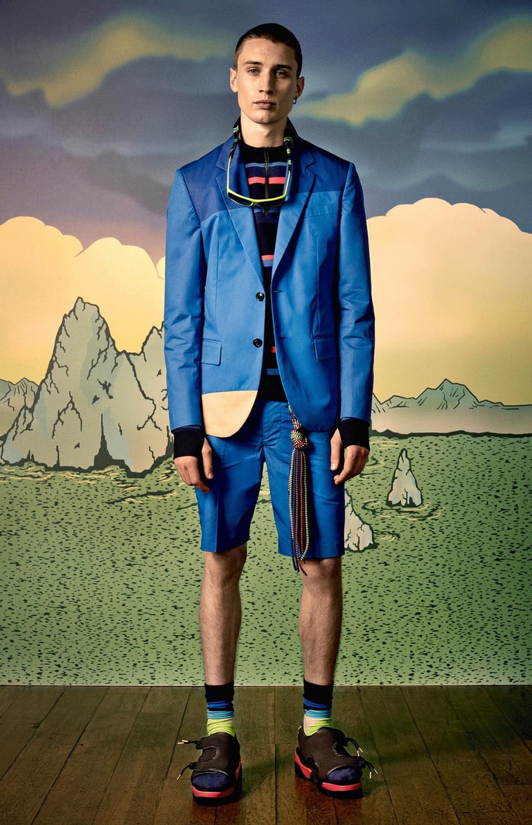
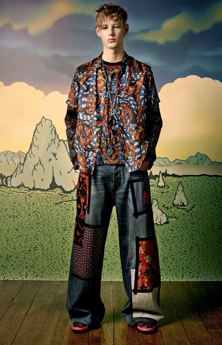
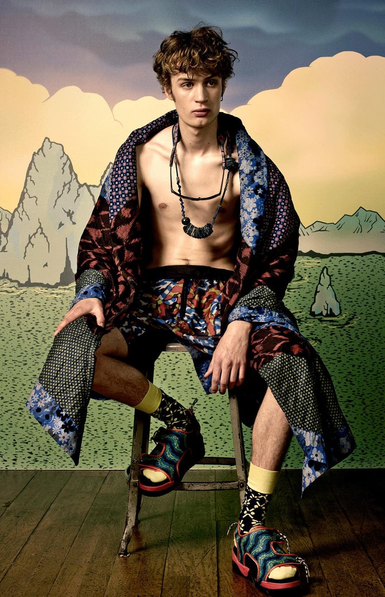
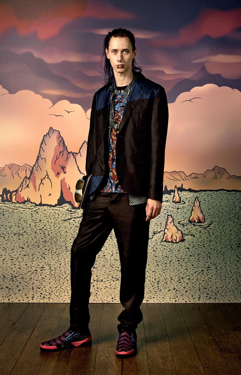
The Spring 2015 Menswear collection embraced a bold, youthful “surf-punk” aesthetic—an energetic fusion of beach/lifestyle references, rebellious attitude, festival culture, and travel-inspired details. The collection drew on “surf-punk,” “Burning Man and summer music festivals,” translated through indigo denim, tie-dyeing, colorful raincoats, and large travel backpacks. The notion of a “gap-year” travel wanderer, hostel-hopping and self-discovering, was cited as narrative underpinning the collection’s spirit.
Collection: Menswear Spring 2015
Role: Designer
Timeline: 2014 – 2015

Concept & Research: Collaborated with the creative directors and design leadership to co-develop the season’s thematic direction—looking into surf culture, travel culture, festival aesthetics, and youth subculture (“surf-punk”). I supported mood-board creation, mapping graphics, color palettes, and fabric inspiration aligned with the narrative of wanderlust and festival energy.
Print/Textile & Material Development: Worked on adapting travel and festival graphics (Polynesian motifs, tiki influences, tie-dye ikat) into wearable textiles. For example, we used indigo denim, waterproof heat-sealed rubber raincoats, large travel-backpacks accessories, and “ragamuffin” jackets decorated with colored duct tape.
Silhouette & Garment Design: I designed key garments such as cotton or jacquard blazers with matching shorts, waterproof rubber raincoats in bold prints, oversized backpacks integrated into styling, and indigo denim pieces with punk attitude. I worked with pattern makers and prototypes to ensure exaggerated festival-ready silhouettes still held functional menswear construction.
Production & Execution: I coordinated with production teams to bring the selected fabrics and finishing details (tie-dyeing, double-wash indigos, waterproof fabrics, backpack hardware) into runway-ready samples. I helped manage sample sign-off, quality check of print placements, and alignment with runway schedule.
In my role as Designer for this seasonal collection, I was actively involved across multiple phases.
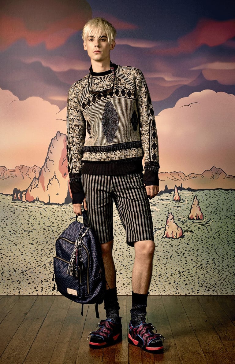
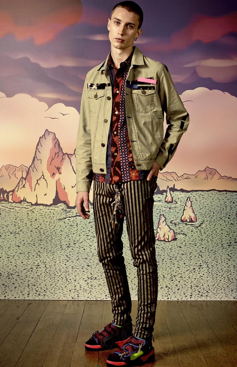

Adventure & Travel: The collection referenced travel culture—“gap year” hostels, backpacks, luggage‐tag leather accessories. Vogue The styling included large travel backpacks, Birk-style sandals, and accessories with a wanderer’s sensibility.
Youthful Rebellion (“Surf Punk”): The surf-punk motif brought together relaxed beachwear, punk graphics, surfboard-ready layers and festival styling. The use of bold tie-dye, ikat matrices, tiki graphics, vibrant prints and streetwear silhouettes gave the menswear line a playful yet edgy tone. Vogue
Cohesive Wearability: Despite the bold graphics and youthful attitude, the collection retained menswear foundations: coordinated blazers and shorts, outerwear with functional finishes, and clear tailoring reference points. This balancing act ensured the line remained commercially viable while pushing creative boundaries.
The design strategy for Spring 2015 hinged on three core pillars: Adventure, Youthful Rebellion, and Cohesive Wearability.


Narrative-to-product alignment: The importance of weaving a strong narrative (travel + festival + surf-punk) into every layer of the collection—fabric, silhouette, print, accessory.
Print/graphic integration: Balancing bold graphic elements with menswear structure—ensuring prints and tie-dyes don’t overwhelm silhouette or wearability.
Production under constraints: Festival-inspired pieces often demand non-standard materials/finishes (waterproof rubber, heavy backpacks as accessories), which challenge timing and budget. Navigating those constraints sharpened my production planning skills.